Aikon Tue Sep 01, 2015 2:07 pm
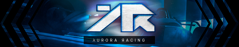
Nattfödd wrote:1. What if we use black background to the left and right for a piece of stadium and a sliding car, maybe zoomed in from the back
2. What do you think about slightly bigger font (1pt) to make alignment of "racing" to R that it won't be too close to the right edge? Or just reduce spacing between aurora and racing?
FYI: I'm not trying to critisize, I'm giving out my ideas and overall vision

Doing it because I like it and care
1. Good idea, I think the stadium background + some auroras would look nice.
2. Yeah just quickly placed the text there, gotta tweak it. The font will change.
Like I said, all the ideas (and critique) are welcome, it's our team banner after all
Just wanna try and make a new one and if you guys like it, you can use it.
Liszt wrote:What about the lambda and backwards R in the AURORA RACING part?
Gonna try that too, at least with the backwards R. Thanks
rachel_bilson wrote:is a gif also an option?
Well I can make gifs, but the quality isn't that great and the file size would get pretty big. Did you have something in mind?
Kazh21 wrote:You might want to wait for the new skin

*hint* *hint* *hint*
Any idea when it would be ready?

Talked with Down earlier and he said the blue skin (ATM used in the preview) and red skin are the most used skins.
I can wait, not in a hurry at all and just gathering ideas here.
Rex Racer wrote:In either case of skins, I think it'd be cool if you did some kind of shadow or highlight effect beneath the cars to create a kind of illusory podium.
Will add shadows, highlights and other effects to the cars (and logo) to make them blend/stand out better when I actually start working on the banner. Not sure if it'll be what you meant with "illusory podium", but the cars will look much better then